Editor's Note: Our post today comes from guest contributor Chris Schimkat of Alpha Digital. Chris takes a deep dive into mobile-first indexing: how Google is implementing it, and how you can prepare your site for success.
Accounting for mobile visitors is important in an increasingly mobile-driven world, and mobile-first indexing is just another reason to make sure your site provides a positive mobile experience. Let's hear what Chris has to say!
Whether you’re new to the SEO game or an experienced optimizer, you may have heard about the recent indexing changes that are causing a shift in site rankings.
For months Google has discussed the future of mobile-first indexing; a new way of crawling sites that involves using the mobile version as the primary starting point for determining rankings.
“Our algorithms will eventually primarily use the mobile version of a site’s content to rank pages from that site…” – John Mueller, 2016 (Senior Webmaster Trends Analyst, Google)
Well, the time has come, and the shift is upon us!

This is no reason to panic (we’ve got your back). There are several ways to prepare your site, which starts with identifying:
- What mobile-first indexing is (and why Google are doing this)
- How mobile-first indexing will affect your site
- If your site is currently on the mobile-first index
- Whether or not your site is mobile-friendly
- Implementing changes to comply with mobile-friendly best practice
1. What is Mobile-First Indexing?
Previously, Google would automatically use the desktop experience as the primary version of the website, whilst mobile was considered the secondary.
Then, Google allowed webmasters to choose if they would like their mobile site to be indexed alongside the desktop version.
Now, Google has begun progressively rolling out mobile-first indexing.
Which asks the question…
Why is Google implementing mobile-first indexing?
The simple and obvious answer is because mobile has become the preferred device for users and the social norm for searching.

Search Engine Land recently reported that more than 50% of total searches are now from mobile devices, indicating that the mobile revolution is well and truly upon us (no shocks there).
Google has always recognized the importance of providing the best and most relevant results to their users, and with more users searching with mobile, it makes sense that the next step forward is focusing on the mobile experience, rather than desktop.
2. How Will Mobile-First Indexing Affect You?
As it stands, Google will continue to have a single index to serve search results BUT will progressively use more mobile versions of content for indexing.

Up until now, if your site had a poor mobile experience with a better desktop experience, it would be okay. This is because Google would still crawl your desktop site first and get everything it needs to pass judgment and determine your rankings.
As Google begins to consider your mobile site as the primary version of your site, you need to ensure that your mobile experience is receiving the same amount, if not more, care and attention than your desktop site.
If your site only has a desktop version, you will still be represented in Google’s index, however you may receive poorer ratings and a lower ranking compared to mobile-friendly competitors.
To put it broadly, if you aren’t trying to provide a better customer experience and cater for their demands (which has now shifted to mobile) your site will perform poorly.
Think about what your customers want:
- Easy navigation.
- Fast load speeds.
- Rich and valuable content.
- Engaging digital experiences.
Then work to deliver these experiences on both desktop and mobile.
3. Is Your Site Already Using mobile-first Indexing?
Step One: Check your Google Search Console message board for a notification with the subject “Mobile-First indexing enabled for …”.
Step Two: You may also notice an increase crawl rate from the Smartphone Googlebot.
If you don’t have a Google Search Console account setup, I highly recommended getting this running ASAP, as it provides extremely valuable data as to what your users are searching, average rank positions and more!
4. Is Your Site mobile-friendly?
Google provides an extremely helpful tool to determine if your site is mobile-friendly. The Mobile-Friendly Tester Tool only requires your URL and within seconds informs you whether your site is mobile-friendly or not. It also provides you with the source of the problem to help you uncover any pesky crawling issues.
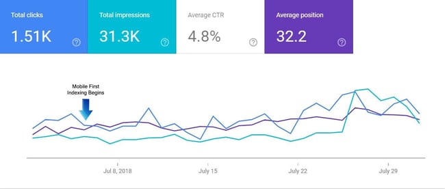
This mobile-only data indicates how mobile-first indexing can positively influence results if your site is mobile-friendly and provides a good mobile experience.
Find and fix any lingering issue to improve your site’s mobile experience and friendliness.
5. How Can You Make Your Site mobile-friendly?
So, this is the big question.
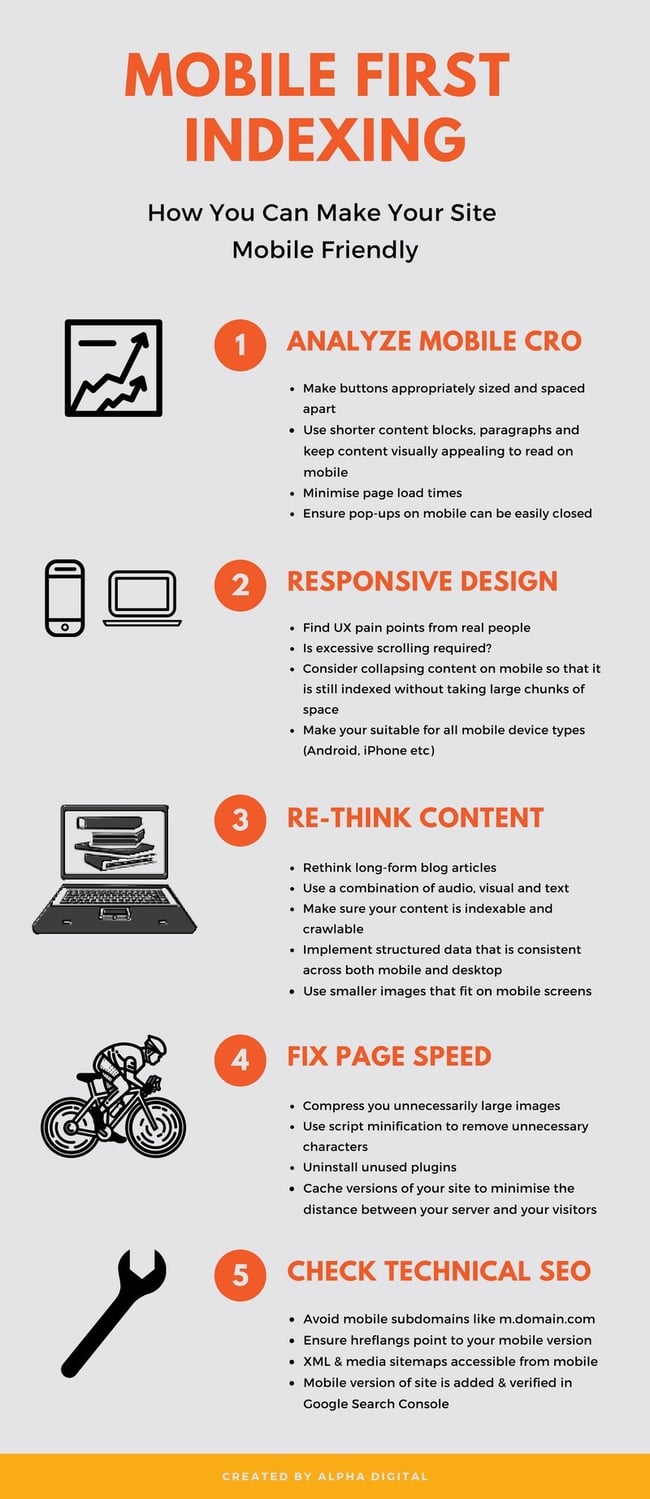
To make it as simple as possible, we’ve narrowed it down to five broad steps to improve your mobile site, which include:
- Mobile CRO
- Responsive Design
- Content
- Speed Optimization
- Technical SEO
If you're a visual learner, check out this infographic.
Let's look at each of these steps individually.
1. Mobile CRO
Conversion Rate Optimization (CRO), revolves around getting your users to convert and ultimately click the buttons that provide you with business. These are your “Buy Now,” “Add to Cart,” “Contact Us,” and so forth.
Start by looking at your mobile conversion data on Google Analytics. Where are users dropping off? Do some pages have higher bounce rates than others?
For example, the conversion rate for users on an Android device might be significantly lower than other devices. Then you might find that the “Add to Cart” button isn’t visible to Android users, so customers can’t complete the purchase process! You would be surprised at how often things like this happen and are missed!
Really play around and dig into your data to uncover these types of issues. Some best practices for CRO include:
- Make buttons appropriately sized and spaced apart (design for the “fat finger”).
- Minimize page load times.
- Use shorter content blocks, paragraphs, and make content visually appealing on mobile.
- Ensure pop-ups on mobile can be easily closed.
- Make your site suitable for all mobile device types (Android, iPhone, etc.).
The next step is to get people on your mobile site and get some honest feedback. These insights are truly an indicator of how mobile-friendly your site is and the best way to find areas for improvement.
2. Responsive Design
This is an extremely important factor in determining if your site is mobile-friendly. A mobile responsive design is one that changes to fit any screen. Take time to ensure that your content looks good and fits the size of any screen, whether its mobile or desktop.
Consider collapsing content on mobile so that it can still be indexed whilst not taking up large chunks of space.
3. Rethink Your Content
When you have a smaller device, you need to make sure that you are really displaying the important content. With smaller screen spaces, you need to ensure that your displaying the same high-quality content as on your desktop site, but in a quicker, easier to digest way.

Google provides a great guide to making your content mobile-friendly, which includes:
- Reformat long-form blog articles.
- Use a combination of audio, visual, and text.
- Utilize infographics to capture a wider audience and create more shareable content.
- Make sure your content is indexable and crawlable.
- Implement structured data that is consistent across both mobile and desktop.
- Employ Google standard meta data, with shorter character counts and optimized keywords.
- Use smaller images that fit on mobile screens.
Ensure that high-quality content isn’t missing on the mobile version of your site. If it’s not there, it won’t be indexed!
4. Page Speed Optimization
Page speed has become one of the most important factors with regards to user experience. Google has recently announced that slow-loading content will not perform as well for both desktop and mobile searchers.
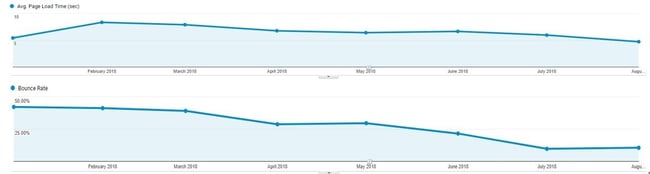
You’ll almost always find a direct correlation between page speed and bounce rate. If you have a slow page load time, your users will leave!
Google knows that people want to find the most relevant information in the quickest way possible and if your site can’t provide this, your rankings will suffer. If your page load speed is longer than three seconds, your users are more likely to exit your site.
People want to be able to find answers and information quickly, and Google is now using page speed as a ranking signal for both desktop and mobile searchers.
Here are tips for improving your page load speed:
- Compress large images.
- Use script minification to remove unnecessary characters.
- Uninstall unused plugins.
- Cache versions of your site to minimise the distance between your server and your visitors.
5. Technical SEO
Avoid using mobile subdomains like [m.domain.com]
While subdomains may seem a bit easier to set up rather than having to create a responsive site, they don’t send strong signals through to Google. Unfortunately, Google is more likely to view the subdomain as a separate website, and therefore view your main website as non-mobile-friendly. This will more than likely lead to problems when attempting to index the desktop site.
Here are some more important technical checkpoints:
- Hreflang: if you are using rel=hreflang for internationalization, ensure that your mobile URL hreflang annotations also point to the mobile version of your country or language variants.
- XML and media sitemaps: Ensure that links to site maps and robots directive are accessible from the mobile version.
- Search Console Verification: Make sure that the mobile version of your site is added and verified to Google Search Console if it’s at a different URL.
In Conclusion
The desktop-first mentality is well and truly behind us. At the end of the day, to get the best possible results, you need to understand exactly what your users want. By unrolling mobile-first indexing, Google is emphasizing the importance of mobile experiences.
Creating positive mobile experiences is a step forward towards providing users with a better overall experience, which in turn will provide your site with improved search visibility — it’s a win-win!