In the early days of publishing, “above the fold” initially referred to the content displayed on the top half of the front page of a folded newspaper. “The fold” literally meant the crease where a newspaper was folded in half; anything below this fold would be invisible to readers until they picked up a paper and opened it. Above-the-fold content was strategically placed in order to catch the attention of would-be readers, enticing them to purchase the newspaper out of curiosity, and to commit to the rest of the content located below the fold. In the digital world, “above the fold” means something slightly different, but the premise remains the same.
All website pages can be broken into two parts: everything above the fold, and everything below the fold. Above the fold content refers to all the elements that are visible to a reader immediately after the site loads, and prior to scrolling. This includes images, texts, forms, ads — anything that readers can immediately see after clicking on a page. Below the fold content is all of the information that a reader needs to scroll in order to see.
Considering what your site, or even what a specific page, features above the fold is important. This is the information that grabs the attention of the readers, addresses a key question or pain point, and determines whether or not the information benefits the user experience as a whole. The perceived value of the information that is included above the fold can correlate with the bounce rate, so it becomes exceedingly important to consider throughout your search engine optimization (SEO) efforts. Additionally, within Google’s page layout algorithm, they explain:
“If you click on a website and the part of the website you see first either doesn’t have a lot of visible content above-the-fold or dedicates a large fraction of the site’s initial screen real estate to ads, that’s not a very good user experience. Such sites may not rank as highly going forward.”
By and large, first impressions are important, and you don’t always get a second one.
Read our comprehensive SEO keyword research guide to learn how you can get your web pages to show up higher in the SERPs.
Check out our ultimate link building guide to learn how to earn powerful backlinks to empower your web content in search.
As time goes on, there are more ways for users to search — desktops, laptops, mobile, and tablets. This creates challenges because what appears above the fold may differ depending on what type of technology is being used to search. There are a variety of factors to take into consideration, like whether the content has been magnified or “zoomed in on,” the size of the screen, screen resolution, and the size of the user’s toolbar.
Sites may choose to place advertisements above the fold because it can increase visibility. In theory, more visible ads can mean more money. However, some users may be turned off by excessive ads that could suppress the main content below the fold. The challenge then becomes deciding how many ads are too many. Too many ads can potentially hurt a site’s engagement and overall performance, including SEO, while too few ads can potentially cut into the site’s revenue.
There is no single solution to addressing the challenges of multi-screen search, but you can optimize your website for the screen resolutions applicable to the majority of your users. Using a responsive web design theme for your website allows browsers to detect screen size and automatically adjust the content to fit.
You can also use Google Analytics to help provide some insight into audience experience by following the steps below:
Once you have figured out how your viewers are generally searching, you can optimize your page layout accordingly.
To help address challenges with ad placement above the fold, make sure to balance ads and contextual information. It is okay to place ads above the fold, but you want to make sure the information that searchers are looking for is the primary content placed above the fold. The Google page layout algorithm mentioned above states the following:
“This algorithmic change does not affect sites who place ads above-the-fold to a normal degree, but affects sites that go much further to load the top of the page with ads to an excessive degree or that make it hard to find the actual original content on the page. This new algorithmic improvement tends to impact sites where there is only a small amount of visible content above-the-fold or relevant content is persistently pushed down by large blocks of ads.”
The ultimate goal of information placed above the fold is to encourage readers to continue scrolling through the rest of your page. The following information is designed to encourage readers to continue scrolling.
The best way to encourage scrolling is to make sure that you are creating content that is designed to satisfy searcher intent. Address the pain point, question, or information that searchers are looking for as soon as you can. Perform keyword research to ensure that you fully understand what searchers are looking for regarding specific topics. Use headers to guide readers, and elaborate contextually to address said information.
If you are new to SEO, or you struggle with technical SEO, you might consider professional SEO services specific to creating quality content. This can include content marketing services and link building services.
When you utilize page trails, you are creating a path for readers to follow that encourages them to continue scrolling. This can be broken down by header, and displayed at the top of the page, to ensure that readers know exactly what is being covered.
Similar to page trails, creating a table of contents can give direct insight into what is covered within the article. This can encourage readers to continue scrolling, or even jump to a specific section that covers the information that they are specifically looking for.
Generally speaking, most paragraphs or images are broken up by the fold. If you ensure that your content is not broken by the fold, you may create empty spaces. Empty space across the width of the page may signal to readers that there isn’t any more information to read. By creating staggered content columns, you prevent any empty space from filling the width of the page — encouraging readers to continue scrolling. This can also help you fit more content above the fold.
According to a mobile search study from Statista, 61% of Google's organic traffic was done via mobile devices. You want to be sure that your site is ready for mobile users. With small screens, there are extra considerations to take into account. Google provides mobile-friendly content tips that encourage sites to:
You can use Google’s mobile-friendly test to ensure that your content is conscientious of mobile users.

We believe in helping businesses find success in search.
Through our partnerships, we help you acquire more business with sustainable link building and strategic content.
Better Links. Better Content. Better Service. Page One Power.
7154 W State Street, Suite 325
Boise, ID 83714


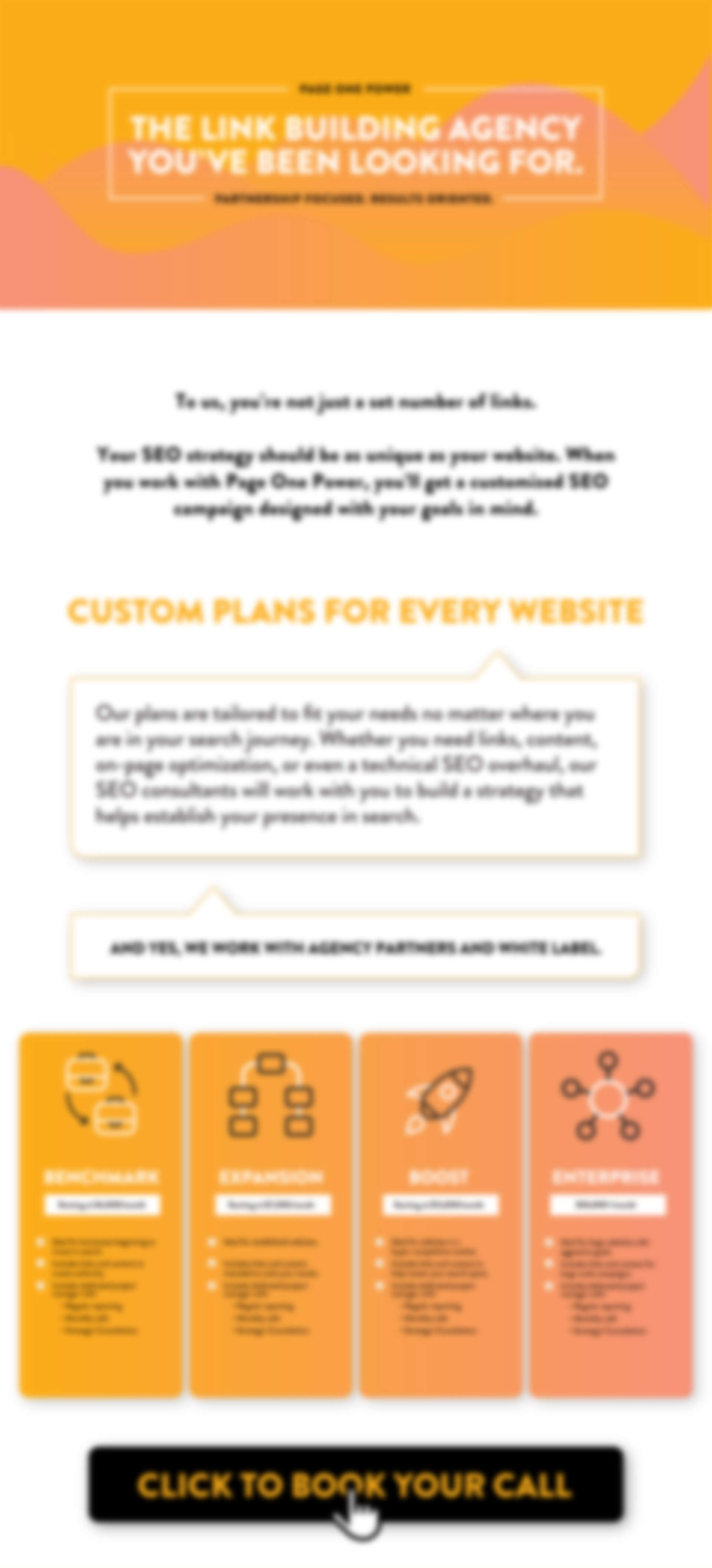
2025 PRICING SHEET
Every website is unique. Our link building campaigns are tailored to your specific SEO needs to ensure we utilize the best tactics for your site. In addition, each campaign comes complete with a dedicated project manager who provides full transparency throughout the entire campaign.
Fill out the form to get Page One Power’s 2025 Pricing Sheet to learn more about our services and pricing.
Copyright © 2025 Page One Power. All rights reserved.