Responsive web design is an approach to designing websites on a fluid grid that responds to the media device of the user.
Responsive web design is an approach to designing websites that seeks to meet the needs of user experience by responding to the type and size of the device they are using. The design elements are fluid and able to optimize for how content is being viewed, and what device it is being viewed on. For example, a logo, an image, and a body of text that may be visible horizontally on a larger screen or desktop may become vertically scrollable on a handheld or mobile device.
This doesn’t mean that you visit a different site depending on the device, it means that the website elements are not fixed in size or orientation. The elements on the page respond to the environment that the visitor is using. They are designed and organized to meet the preferences of how users tend to prefer to search, scroll, read, and interact with websites using different devices or screens of varying sizes. Utilizing responsive web design in addition to your other SEO efforts such as building search-worthy and valuable content, performing technical audits, and securing valuable backlinks to ensure that your site is at optimum performance, can greatly enhance the user experience on your website, while increasing your site’s visibility.
A responsive site consists of a mix of fluid grids, layouts, responsive cascading style sheets (CSS), and hypertext markup language (HTML), where page elements can be customized and sized by proportion rather than pixels. As an example, the size of page elements such as a logo, an image, and body of text are not set to exact width (a static set amount of pixels), but are designed to be dynamic and adaptive.
In using responsive web design techniques, you could decide that the logo should take up 20% of the page, the image should take up 30% of the page, and the text should take up 50% of the page. The elements orientation and spatial arrangement could be responsive so that when they are viewed on mobile or handheld devices, they become vertically scrollable; or, if they were viewed on larger or widescreens, they may become horizontal. The point of responsive designing is to cater to user behavior and respond and optimize for the experience and environment of different devices and screen sizes.
The United States Census performed an American community survey that found more than two-thirds access the internet on mobile devices. Globally, mobile internet traffic as a percentage of total web traffic accounted for 51.56% of web views. Google also recognizes the mobile trend, encouraging website owners to become more mobile-friendly, stating that mobile-first design is critical to SEO for your business or website. The search engine giant has also reorganized how it crawls and evaluates, to incorporate the best practices for mobile optimization in the indexing of websites in addition to making sure you are performing on-page SEO basics and best practices.
Websites that are easy to navigate regardless of screen size may be more friendly and accommodating to the growing audience that accesses the internet from a variety of devices. It also relieves web designers, developers, and interface designers from having to create a website for every single potential device by utilizing flexible HTML elements that adapt to whatever screen size and user preference while utilizing the same URL.
You can use your browser to view what your page looks like from a mobile, tablet, or desktop perspective by doing the following:
Google also has a Mobile-Friendly Test that you can use to see if different pages of your website are mobile-friendly.
Read our comprehensive SEO keyword research guide to learn how you can get your web pages to show up higher in the SERPs.
Check out our ultimate link building guide to learn how to earn powerful backlinks to empower your web content in search.
Creating a responsive website is more than just adjusting to screen size; it is a new way of thinking about how people and webpages interact and how they do so in different environments, on different devices. It is an approach to design that takes on the idea of making flexible elements that create a website, space, or page, that people feel comfortable navigating, and want to interact with. Designing web pages that cater to the user is more than just configuring how the page will adapt and load, but can also include site and page speed optimization.
A media query is a CSS technique that tells a webpage to display specific elements only if a certain condition is true. This means, that when a web page is fetched, the page discovers what the conditions of the device are — for example, what the resolution of the screen is. If the media query discovers that a page is being displayed on a handheld or mobile device with a portrait view, it will display HTML elements such as header tags and the following content, or other page links to that condition, such as: displaying the webpage in a vertical scroll. If the media query discovers that a screen has a landscape orientation and a larger screen, the page will display with a horizontal view that best fits the screen resolution.
Creating responsive web design is done through CSS and HTML to resize, hide, or shrink or enlarge to scale, and make content fluid and movable to meet the needs on any screen or browser size.
Images and content can now be automatically and fluidly adjusted so that the layout never breaks. This means that images and content can scale to size, or may rotate from portrait to landscape orientation. The fluid grid layout may also:
It is important to note that responsive web design is not plug-and-play. Images, logos, and text still need to be considered for how they will react to a fluid grid. Images could appear as low quality, or text may become unreadable. This curation of page elements in the context of responsiveness is what makes the responsive approach to designing web pages for humans unique.
With the changing landscape of technology and devices and the adoption of different capabilities of interactions such as touch screens, voice commands, and local search becoming more common on a variety of devices, the solutions and designs to making web pages as accessible and user-friendly will continue to develop. Responsive web design is probably not the final answer in meeting user expectations on webpages, but is simply a step in the ever-changing world of devices and creating mobile-friendly experiences online.
Responsive designs are typically used for visitors who view a website on their mobile phone or tablet and you can see some of the common sizes of these screens and how our website (pageonepower.com) responds to them.
Mobile:

Tablet (portrait):
Tablet (landscape):
These responsive designs help provide the best possible experience for our users.

We believe in helping businesses find success in search.
Through our partnerships, we help you acquire more business with sustainable link building and strategic content.
Better Links. Better Content. Better Service. Page One Power.
7154 W State Street, Suite 325
Boise, ID 83714


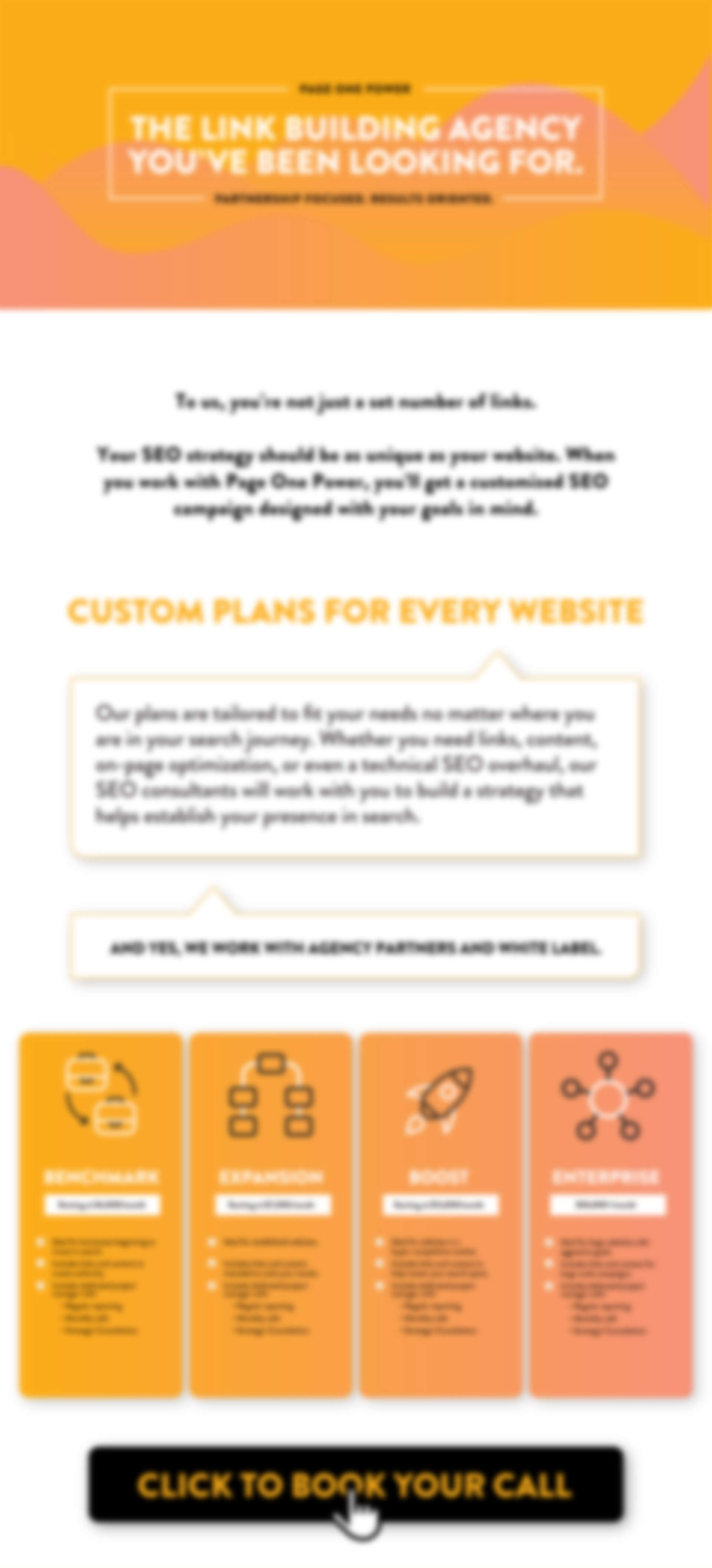
2025 PRICING SHEET
Every website is unique. Our link building campaigns are tailored to your specific SEO needs to ensure we utilize the best tactics for your site. In addition, each campaign comes complete with a dedicated project manager who provides full transparency throughout the entire campaign.
Fill out the form to get Page One Power’s 2025 Pricing Sheet to learn more about our services and pricing.
Copyright © 2025 Page One Power. All rights reserved.