If you’re in the digital marketing or online SEO space, then you may have heard about or be familiar with heat maps. Heat maps are used by SEO and digital marketing professionals to represent raw user interaction data to site owners. They can be used and interpreted in many ways, both independently and in tandem with other web page analytics. Heat maps are a data gold mine for anyone invested in a site’s performance or user interaction. Whether you’ve seen them before or are encountering them for the first time, understanding what a heat map is and how they’re used can greatly assist your SEO efforts.
A heat map is a data visualization that showcases different ranges of user interaction on a webpage. They are a communication tool between marketers and site owners that may be included as a part of a content marketing campaign. By using a heat map, site owners can get real-time data about the performance of their page in an easy-to-understand way that doesn’t require any in-depth SEO knowledge. Heat maps may focus on different types of user interactions, depending on the priorities of the site owner or the focus of the campaign.
Different types of heat maps measure different types of interactions. Interactions types may include:
Your content marketing campaign may include one or all of these types of heat maps. Each type can tell you more about your page's performance in relation to user interaction and can be further contextualized with the use of other page analytics.
Read our comprehensive SEO keyword research guide to learn how you can get your web pages to show up higher in the SERPs.
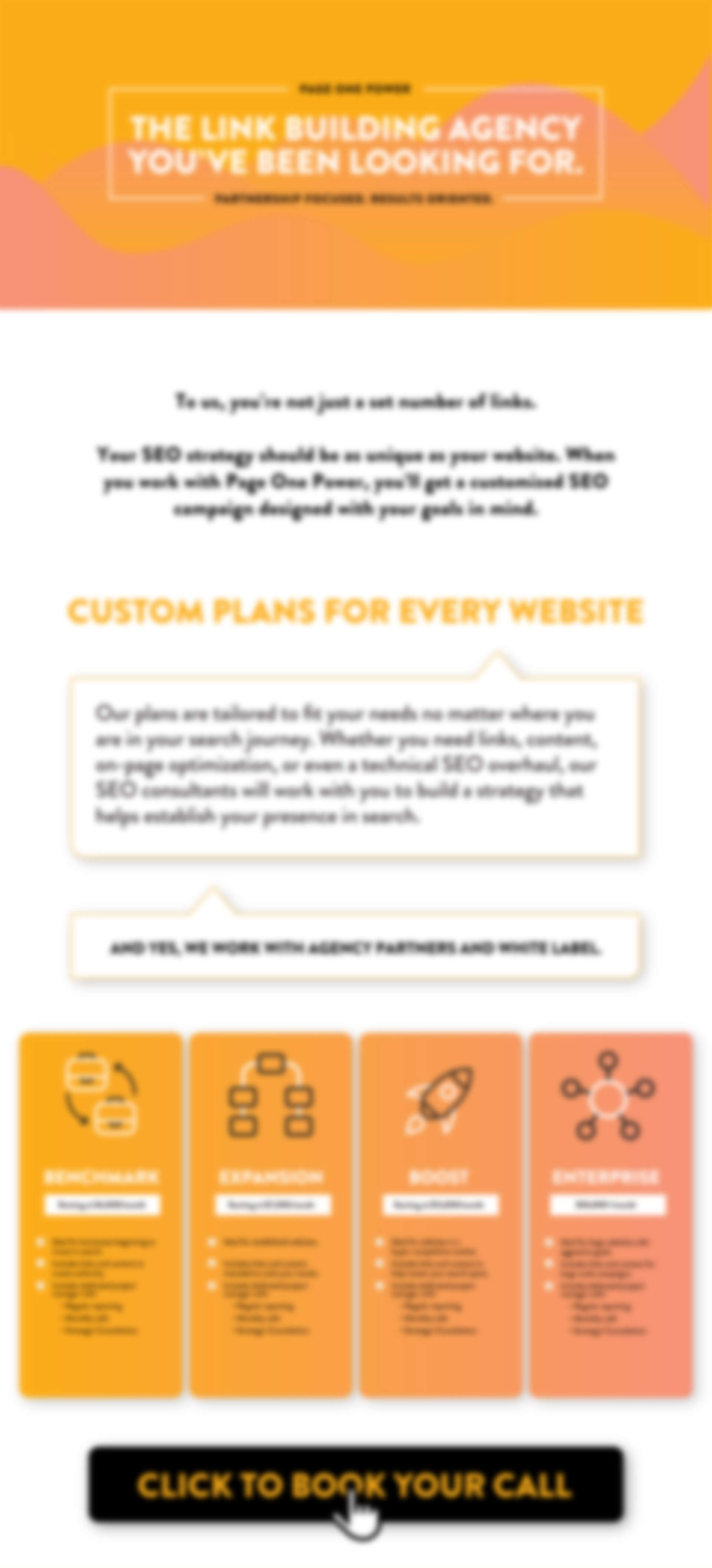
Check out our ultimate link building guide to learn how to earn powerful backlinks to empower your web content in search.
Reading a heat map is designed to be intuitive for anyone involved in a site or SEO audit. Imitating an actual temperature map, hot colors — reds, oranges, yellows —- demonstrate high interaction rates. This could represent high click-throughs, areas where users are hovering, and scroll patterns. Cool tones — blues, greens, or even whites — display areas of lower or non-existent engagement of all the mentioned types. For example, if your heat map shows that visitors to your page are immediately scrolling as soon as the page loads, this could be an opportunity to optimize your page header, whether it be an ad, image, or content.
It’s pertinent to note that heat maps don't contextualize why an area may register as a certain color. However, they can jump-start an investigation into what could be causing low engagement in certain areas, or establish a template for success with high engagement areas. This type of real-time, evolving feedback can be a valuable tool when making changes to improve page performance or conversions
Heat maps provide a rich amount of data that can be applied in many ways to improve your SEO practices or your site structure and design. While heat maps are representative of raw data but don’t contextualize data, there are still many ways that you can interpret and apply heat map data to your desired practices or priorities.
Heat mapping can help you conceptualize your overall site structure in an effort to make it more intuitive, user friendly, or to improve the prominence of important elements, such as:
You can also heat map ads individually to see if they are getting attention, how well they are designed, if users’ attention is being directed properly, and how fast users try to close out of ads.
Success areas, or high interaction areas, aren’t the only areas that have value when interpreting a heat map. Cool areas can tell marketers and site owners where people aren’t clicking or hovering, or where interaction is lower. This can be indicative of many things, including: loss of interest, inability to navigate the site, or a mixture of both. You may find that heat mapping shows your content or your ads are too aggressive or otherwise off-putting, and making changes could ultimately help improve your site’s linkability. By using heat maps in tandem with other site metrics and SEO practices, you can learn more about what user interaction tells you about your users’ intent.

We believe in helping businesses find success in search.
Through our partnerships, we help you acquire more business with sustainable link building and strategic content.
Better Links. Better Content. Better Service. Page One Power.
7154 W State Street, Suite 325
Boise, ID 83714


2025 PRICING SHEET
Every website is unique. Our link building campaigns are tailored to your specific SEO needs to ensure we utilize the best tactics for your site. In addition, each campaign comes complete with a dedicated project manager who provides full transparency throughout the entire campaign.
Fill out the form to get Page One Power’s 2025 Pricing Sheet to learn more about our services and pricing.
Copyright © 2025 Page One Power. All rights reserved.