What is a Website footer?
The website footer is pivotal in helping users access valuable information, offering easy navigation and site usability. The footer also commonly features copyright notices, basic information about the website, and potentially an associated address.
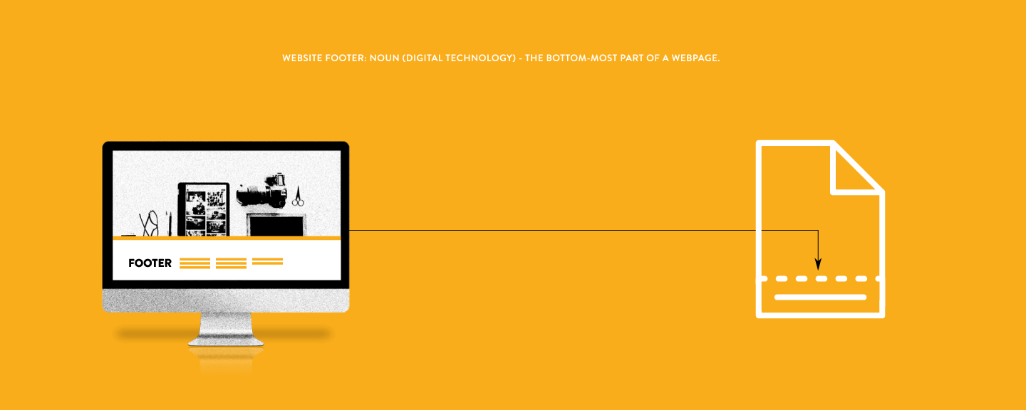
Typically, site owners design website footers to provide supplementary content that enhances user experience without distraction.
From contact details to social media icons and sitemaps, footers are a functional and aesthetic hub for all the tidbits that make your website whole. It’s essential to construct your footer carefully to provide users with the experience they want.
Why a Website Footer Is Important
Lost in the display of your main content, users often turn to footers for guidance on what to explore next. From sitemaps to page links, footers are the navigation that keeps your audience on the right track. Apart from providing navigation assistance, footers are the ultimate trove of valuable information. For instance, they:
- Emphasize important content and ensure visitors don't miss call-to-action opportunities.
- Help establish brand identity. From adding a copyright symbol to including logo links, footers reinforce your website's overall design.
- Connect your audience to your social media profiles.
- Contribute to accessibility and user-friendliness.
A few key elements make for an effective website footer.
Essential Footer Elements
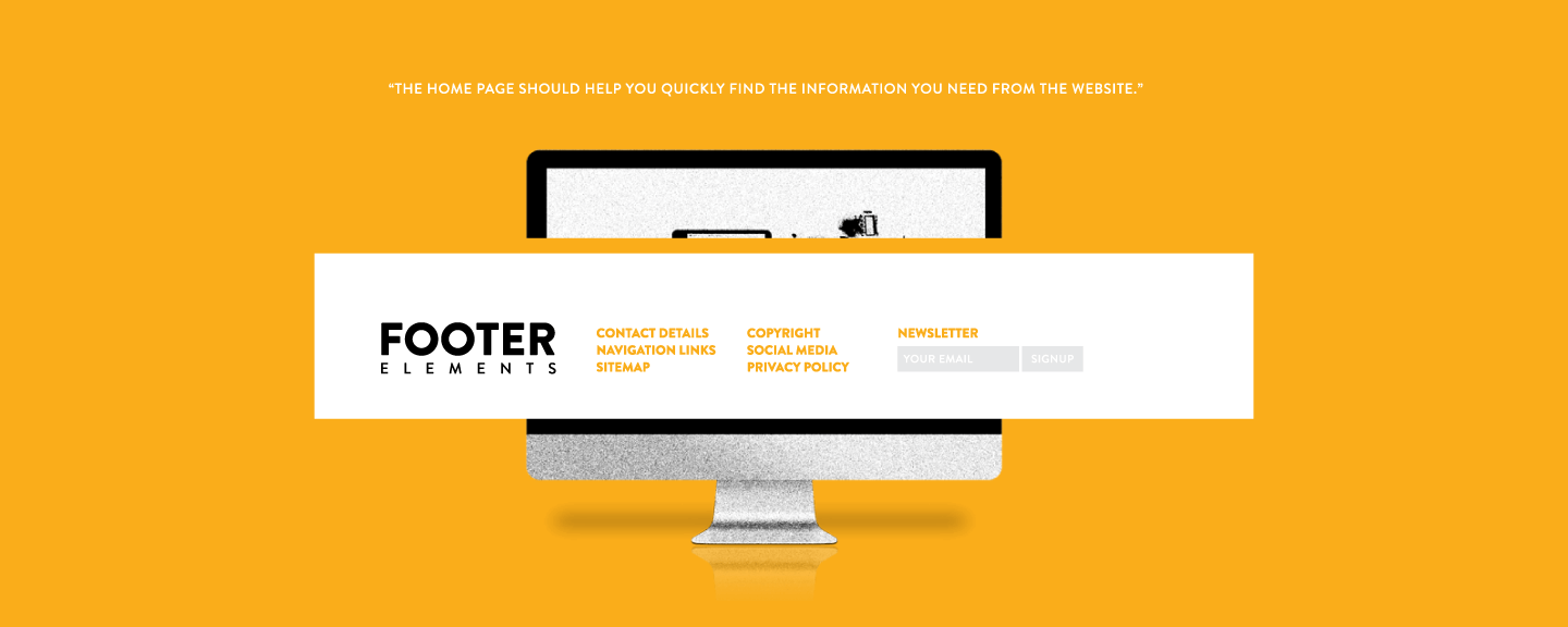 While there isn't a one-size-fits-all approach, the following elements are essential for ensuring your website's footer is functional and efficient:
- Contact details: Include email address, phone number, or physical location.
- Navigation links: Offer a clear path for users to explore your website further.
- Sitemap: Gives visitors an overall sense of what content is available on your website, serving as a valuable reference tool.
- Copyright information: Safeguards your intellectual property.
- Social media links: Foster engagement and help spread your message.
- Privacy policy & terms of service: These legal documents reassure users their data is safe and their rights respected.
- Newsletter sign-up: This lets users stay connected and receive updates on your latest offerings, promotions, or news.
As you weave these essential elements into the fabric of your footer, you can also spruce up your design with additional features such as language switching and currency selection, ensuring visitors of all backgrounds feel welcome.
Organizing Footer Content
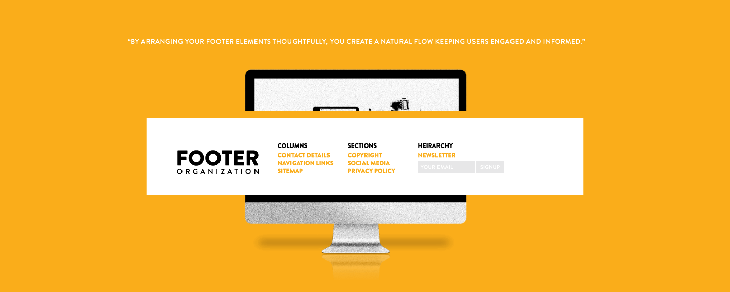 Now that you know what elements to include in your footer, it's time to think about how to organize them.
- Columns: Provide structure and balance to your footer. By dividing content into neatly arranged sections, columns allow users to locate information swiftly.
- Distinct sections: Make it easy for users to differentiate between various elements. Use borders, whitespace, or varied typography to specify each section.
- Logical hierarchy: Organize content based on importance and relevance. Begin with the most critical information, then proceed to secondary elements.
By arranging your footer elements thoughtfully, you create a natural flow keeping users engaged and informed.
Optimize for User Experience
Consider your target audience and their needs to guide the design journey. Think how different types of visitors may interact with your footer and ensure there’s an overall evenness so that it's easy for them to find their way around.
Of course, you want the internal links for navigation, indexability, and crawlability.
Accessibility and Readability
Pay attention to font size. The text must be large enough for those with vision impairments. You want your visitors to feel included and satisfied. Consider the following design tips:
- Use white space to separate sections and make it easier for users to distinguish between different elements.
- Incorporate visuals such as icons and illustrations for easier identification.
- Create contrast between sections using different font sizes, weights, and colors.
- Design for clarity and ensure the typography is legible and easy to read.
Remember, the more straightforward the design, the better.
Responsive Design for Mobile Devices
 A website should adapt to different screen sizes and resolutions. Ensure your website looks as good on mobile devices as on desktop, and ensure the entire design — including the footer — is responsive. This means it should automatically adjust to fit whatever screen it’s displayed on.
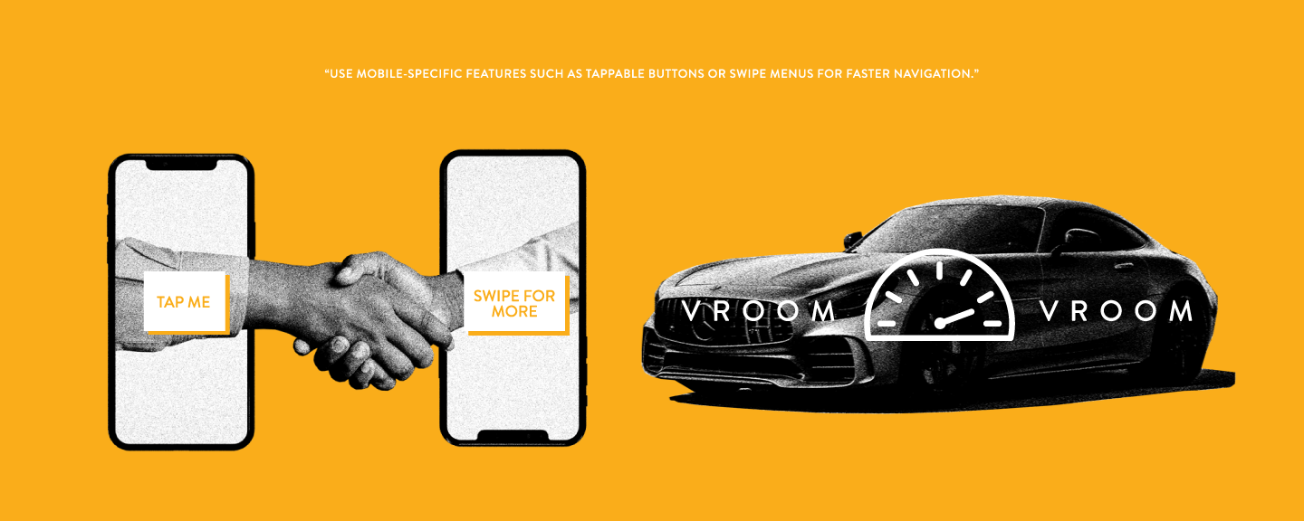
Similarly, too much content can cause your site to load slowly and hinder the user experience, so keep it concise. Use mobile-specific features such as tappable buttons or swipe menus for faster navigation.
SEO Considerations for Footer Content
Carefully choose keywords to incorporate into your anchor text and ensure your internal links work seamlessly.
Additionally, steer clear of black hat SEO practices like keyword stuffing, link schemes, and other deceptive techniques. Instead, your website footer will contribute to your overall SEO success by focusing on honest and transparent optimization.
Regularly Update the Website Footer
The most successful websites are regularly updated with fresh content, including the footer. So, at a minimum, check it once a year to ensure all the links and information are up-to-date.
From a single column to an elaborate design, there are limitless possibilities when creating website footers. While aesthetics play a key role in how the footer will look, functionality is just as necessary.
