What's a Call To Action (CTA)?

A call to action or CTA is a statement that encourages the reader to do something or take a desired next step.

What is a Call to Action? CTA Definition and Examples

A call to action (CTA) is a statement encouraging you to do something. Brands use CTAs in all sorts of content, including blog posts, landing pages, converting pages, advertisements, pop-ups, and meta descriptions of web pages.     

You’ll find most typical CTAs on a brand’s converting page — that is, the page on a website where you can sign up for, buy, or download whatever the brand is promoting. Elsewhere, a blog post may urge you to comment or will try to usher you further down the marketing funnel to a converting page. 

Content consumers are very used to seeing CTAs. When you’re inundated with do-this, do-that statements and buttons to click, you tend to ignore them unless they satisfy your initial intent. While we’re much more than monkeys these days, it’s still safe to say that most of the time, a monkey won’t reach for a banana unless that monkey is hungry. This is why it’s important to use CTAs effectively.

Why Does Your Call to Action Usage Matter?

Calls to action matter because they give the user the opportunity to become a customer, client, or subscriber. In its most essential form, the CTA is an extension of the user’s will, allowing them to reach out and grasp the product or service that they’re seeking.

On one hand, some businesses make the mistake of including no CTA whatsoever: a study of small business B2B sites found that 70% didn’t have a CTA. On the other hand, some businesses tend to jump the gun, prioritizing the presence of a CTA upfront over a clear value proposition. A landing page A/B test from MECLABS found that placing the call to action at the bottom of a page after a value proposition led to a 220% higher conversion rate than a page with no value proposition and a CTA above the fold. 

Opting not to include CTAs on a website is a mistake because it doesn’t give the user an easy avenue toward conversion. At the same time, prioritizing the CTA over a value proposition is like telling the user they should buy a car before explaining what’s great about the car. If the user is out looking for a car, you must convince them the car is a winner before you try to sell it. If the user is curious about new cars in general, you must convince them you’re knowledgeable before you try to sell them on a particular car.

Want to learn more?
Visit our blog to learn more about search and search engine optimization.
To The Blog
 SEO Keyword Research

SEO Keyword Research

Read our comprehensive SEO keyword research guide to learn how you can get your web pages to show up higher in the SERPs.

Link Building Guide

Link Building Guide

Check out our ultimate link building guide to learn how to earn powerful backlinks to empower your web content in search.

When Is It Best to Use a Call to Action?

CTAs should appear after value propositions on converting pages, at the bottom of blog posts as part of the page layout, and they can also appear in mid-funnel blog posts as part of the text.

Mid-funnel blog posts are part of a comprehensive linkable content strategy. Linkable content is content people will want to link to because it provides valuable information. “Mid-funnel” refers to a specific class of content within the marketing funnel, which includes a top, a middle, and a bottom. 

In general, top-funnel content is the most linkable; it doesn’t include a CTA in the text because it is purely informative, but it does link to your mid-funnel content. Mid-funnel content gets more granular, providing specific information about your type of product or service. It’s a good idea to include a CTA at the end of a mid-funnel post, such as, “See how our solution works for you.” You’ll then link to your converting page, which includes your value proposition.

There’s a difference between in-text CTAs and converting CTAs. The difference comes down simply to a button. Converting CTAs are typically buttons you can click, while in-text CTAs urge you to read more, explore options, or comment on the article. 

You can place a CTA as part of the page layout on every page of your website. This type of CTA button gives users the opportunity to sign up for an email list, get in contact, or buy something on a converting page. The following examples will show you how this looks.

Call to Action Examples

First, an example of an in-text CTA from our blog — since link building is one of the services we offer at Page One Power, this CTA appears towards the end of a mid-funnel article about link building for a company in the health niche.

Screenshot of Page One Power blog post with call-to-action in orange font above an image of a woman in front of the ocean.

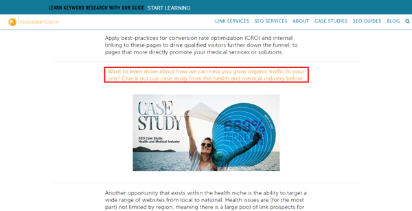
Note that the CTA is very clear — it’s set off from the rest of the content, has a different color of text, includes a specific description of what the reader will be viewing, and has a captivating image to go with it.

This next in-text CTA from The Write Life breaks the rule about placement at the end of the post, but it’s very clear with its value proposition.  

Screenshot of The Write Life Blog post with call-to-action in italics beneath the image of a hand holding sparkler.

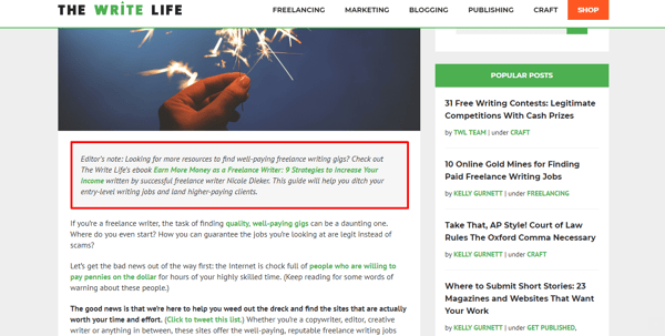
Note that you know exactly why you should click on the link — you can “ditch your entry-level writing jobs and find higher-paying clients.” The editor knew the reader clicked on the article to find freelance writing jobs, so it makes sense that they might be interested in reading an ebook on the subject right out of the gate.

Here’s an example of a CTA from one of the most successful digital newspapers going today: The Guardian.

Screenshot of The Guardian’s call-to-action with value proposition above bold font highlighted in yellow.

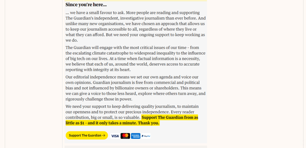
This CTA comes at the end of articles on the website. Note that the newspaper is very thorough and convincing about its value proposition. Due to the nature of the site and its content, The Guardian makes the safe assumption that readers are leads who may be willing to contribute. Also, placement at the end of the article makes sense — the reader who makes it all the way through an article is more likely to appreciate and pay for what The Guardian has to offer.   

This next CTA is the type you’ll find as part of the page layout on a blog. 

Screenshot of Page One Power call-to-action inviting reader to subscribe to email updates.

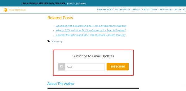
This appears at the bottom of a blog post. Note that this is the type of CTA that should be seen when a visitor is not yet a lead. After they sign up for email updates, further CTAs can prompt them to head farther down the sales funnel.

Here’s an example of a CTA at the end of an Entrepreneur blog post specifically tailored to the type of content preceding it:

Screenshot of Entrepreneur call-to-action inviting reader to join the 2019 Entrepreneur 360 List.

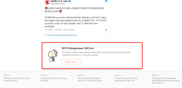
The blog post is about Netflix and its movie Murder Mystery, so Entrepreneur infers the reader may be interested in performance information about privately held companies (such as Netflix). The CTA gives you the opportunity to access this information.   

Speaking of Netflix:

Screenshot of Netflix converting page with red call-to-action button below illustrative graphic. 

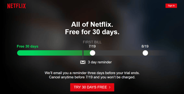
This creative CTA illustrates the offer vividly. Note that the CTA is specific. It’s not “Try Now,” it’s “Try 30 Days Free.” The “free factor” is hard to pass up (but the email reminder about the trial expiration will be easy to ignore). There’s a reason why Netflix has so many subscribers.

To make great CTAs, think about the placement, specificity, visual appeal, and relevance of the message. Tailor your CTAs to where the visitor is in the marketing funnel and you’ll see the best results.